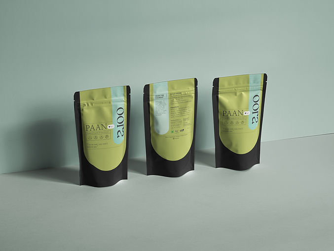

Expression for every Indian’s favorite refreshment.
Oora translates to water in the greek language. This product uses freeze-drying technology to elongate shelf life which makes the product more travel-friendly and easy to indulge in.
CLIENT
Oora
AREA OF WORK
Logo, Identity, Content, Social Media
YEAR
2022
TEAM
Self

Brand Color

When deciding on the color palette, we decided to go with something more vibrant; that catches one's eye in a grocery aisle. It was also chosen to keep in mind the eclectic colors that describe Indian food and spices. The blue brings in the meaning -- water and freeze-drying technology while the green depicts the color of the beetle leaf which is the specific product under this brand name.
Logo
The "r" and "a" have a water drop blend into the logo. The style used here is the more minimal modern type to depict the new age of Indian packaged food.

As the sole designer, my role was not only to create brand assets and language but also to design the product packages and the initial content experience creation used across social media platforms.
Small Size Product Packaging
For the small packaging, we went with a sticker that extended to both sides of the package. It acted like a seal and ensured that the packaging is not tampered with.

Full Size Product Packaging
Since the product is more on the expensive side, it had to look the part as well. We decided to go with recycled matt paper with a subtle gradient on the sides.

The product packaging was designed keeping in mind the future plans of the company. It would be easy to switch out and replace the color (green) and product name according to the product offering. In the near future, they plan on extending their freeze-dried product line to incorporate fruits (strawberries, bananas) and vegetables (broccoli, beetroot) as well.
Content Creation
The initial posts were mostly about educating the customers about the brand. This included information about the technology, the founder, the chef, and the product itself. It was also to emphasize the extended shelf life of the product that made it travel-friendly. Once we saw some traction on the Instagram page, we started creating content around events, collaborations, and hampers.


